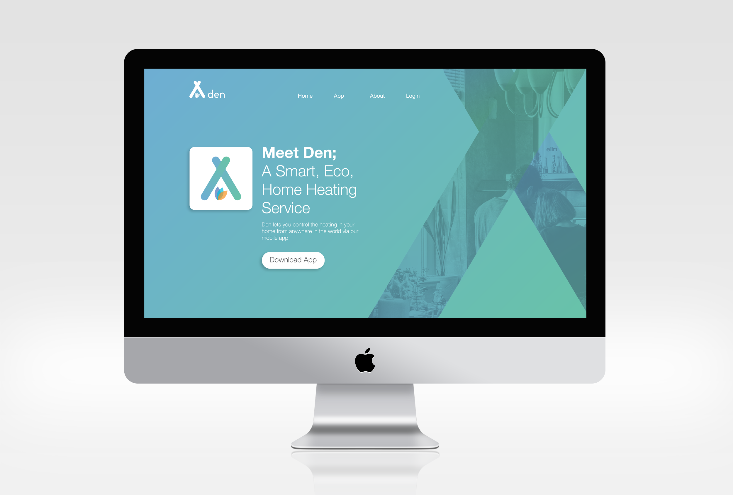
Den (concept)
Den is an eco energy company who are developing a state of the art system that lets you control the heating in your home from anywhere in the world via a mobile app.
A full brand identity was required with this brief, including a logo, webpage mockups, and app page mockups as well as advertising for the product. The brief stated that they were trying to appeal to young homeowners and that they had a preference for simple vector icons with gradient styles.
I began by designing the logo with my process mapped out below. Route 1 involved taking apart the word den and reducing it to its simplest form; that of sticks pushed up against one another to create a shelter. I then played around with incorporating features of 'den' into the simple shelter, finally opting for a shape that both represents the ecological nature of the app through the leaf motif and the heating element by showing 3 colours merging to orange; representative of fire. Route 2 explored connections with the home whilst using a warmer gradient, route 3 demonstrated some options circulating around the ecological friendliness aspect of the company and route 4 questioned how the letter 'd' from den could be imposed upon a house vector.
I went for the design from route 1 as it is the logo which I felt met the brief the best. It keeps things simple and represents the elements of the brand through use of colour and symbolic statement.


